
Priscilla Robinson
View the latest spreadsheet here
A generally quieter week this week, except for the Western Pacific and Africa. Compared with the week before there is just a small increase in case numbers and fatalities.
And of course for those of us in Australia, we are getting a bit of a taste of what major outbreaks are really like from the inside and much of the rest of the world has been dealing with for a long time now.
This week the overall case fatality rate has fallen to 2.09, heading very much in the right direction, and the worldwide case rate is 2.7% – it is important to remember that 97.3% of the world’s peoples have apparently NOT had COVID-19. The main spreadsheet is tracking 60 countries, around 70% of the world’s population, and amongst these countries the overall rate is higher, at 3.3% with a 2.11 fatality rate (that still means that 96.7% of people haven’t had it in these countries). As the countries being tracked here are mainly larger (and exclude most of South America and most small island nation states) there is a bias in this reporting which I cannot really solve by adding more countries. There are important reasons for these differences, and as I have mentioned many times reporting systems (and even definitions) are not consistent. Why otherwise would there be such ridiculously high fatality rates in Peru, for example? So, to reiterate, again, and sorry to be boring, this is about long term trends within countries, and some way of comparing between countries, but remember to be critical, and don’t listen to too many reports including scary words like ‘surge’.
Some specific problems: In the Western Pacific Region big increases included Australia 10%; French Polynesia 33% in cases where there has been an almost 50% increase in fatalities; and Brunei Darussalam with more than double its cases in one week, and as fatalities have not changed that might be different next week. Palau has notified its two first cases. In Africa, Uganda has had a 20% increase in cases, Eswatini 10%, Benin 25%, Mauritius 33%, Guinea Bissau 10%. Thailand has had another 10% increase, but otherwise the South East Asia Region is relatively quiet this week although there has been an increase in fatalities in some countries, probably a reflection of the previous increase in cases.
But we still do not have any really comprehensive epidemiology.
However, remembering the start of the pandemic, it was mainly older people who were affected and went into hospital, and who were more likely to die. Older people have also been the early focus of immunisation programmes. Which means that the people who are best protected/immune now are older people. And who is not protected/immune? Younger people. Who have not had access to vaccines yet? Younger people. So why is anyone surprised that this is the group now getting COVID-19?
The attack rates that we have, tell us about whole communities, but not much at all about the groups within communities. We have known for a long time that this virus transmits between close contacts, mainly friends and family, and even though the R0 (remember reproduction rates?) remains low at maybe up to 5, there are many factors affecting this including the behavioural habits of younger people not being quite like those of older people. Some groups of people will have had most of the group be infected, and other groups will be COVID-free (and therefore vulnerable, especially if they are not vaccinated). So yes, we need herd immunity, not just in whole populations but also within peer groups if we really want to stop transmissions leading to hospitalisation. We also need ‘herd immunity’ to be about the entire population and not just sub-groups; there seems to be some comment that the herd immunity just needs to be in the groups eligible for the vaccine, but that is not what herd immunity means. Just saying.
And although the vaccination rate is increasing fast, the problem with wealthy countries doing much better than resource-poor ones remains. Worldwide, 42% of people are now fully vaccinated, but that ranges between 48% in wealthy countries down to less than 0.5% in resource-poor ones. And it was all SO predictable. Quite apart from the effect of the various conflicts … let’s not mention the wars …
Now, here is another way of looking back over the whole pandemic. On these charts you can see the waves of infection, both worldwide and within the six WHO regions. I think its interesting that the patterns of infection look quite different. That the Western Pacific Region (WPR) and South East Asia Region (SEAR) didn’t get many cases until fairly recently shows well, especially the WPR which had ripples rather than waves until the last few months.

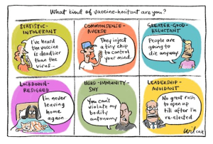
For people who have not seen this cartoon, have a smile.
See you next week
Priscilla
About Dr Priscilla Robinson and The CODE Update
Dr Robinson is a public health epidemiologist with particular interests in international health and communicable diseases, and public health competencies. She has worked in health departments in England and Australia, has managed public health teaching programmes, and taught and researched many aspects of public health epidemiology and policy in many countries. She is an adjunct Associate Professor at LaTrobe University, and to stop herself being bored is an editor of PHAA’s journal ANZJPH, and holds board positions (almost all unpaid) on various NGOs, journals, and at her local hospital. Otherwise, 10 acres of untamed bushland on a hill in South Gippsland makes weight-bearing gym exercise and strength training a bit redundant.
The CODE Update is a regular feature on the Intouch blog to keep readers informed of COVID-19 developments around the world.
The CODE update originally began at the start of the SARS CoV-2 pandemic as a way of explaining it to Priscilla’s friends and family who happen to live all over the world, and who were being bombarded with information and misinformation in their own countries. The CODE Update provides links to practical materials and papers written for people who are not versed in the language of outbreaks and epidemic curves. It is sent out every week, and includes a short commentary to provide context to the numbers included in the spreadsheets.
Note: Whilst every attempt is made to transcribe all data faithfully, every now and again mistakes are made and not noticed until the next update. Also, on occasion numbers are revised after posting at the source databases.
We hope you will find these updates to be a helpful tool, and the links to current information useful.
Leave a Reply